Color is very important in the production of advertising signboard, but because each favorite color is different, so according to the different production of outdoor advertising, different size, different application, the color requirements for the design are also different, how to design a good-looking work out. So here's how to design a better advertising signboard?
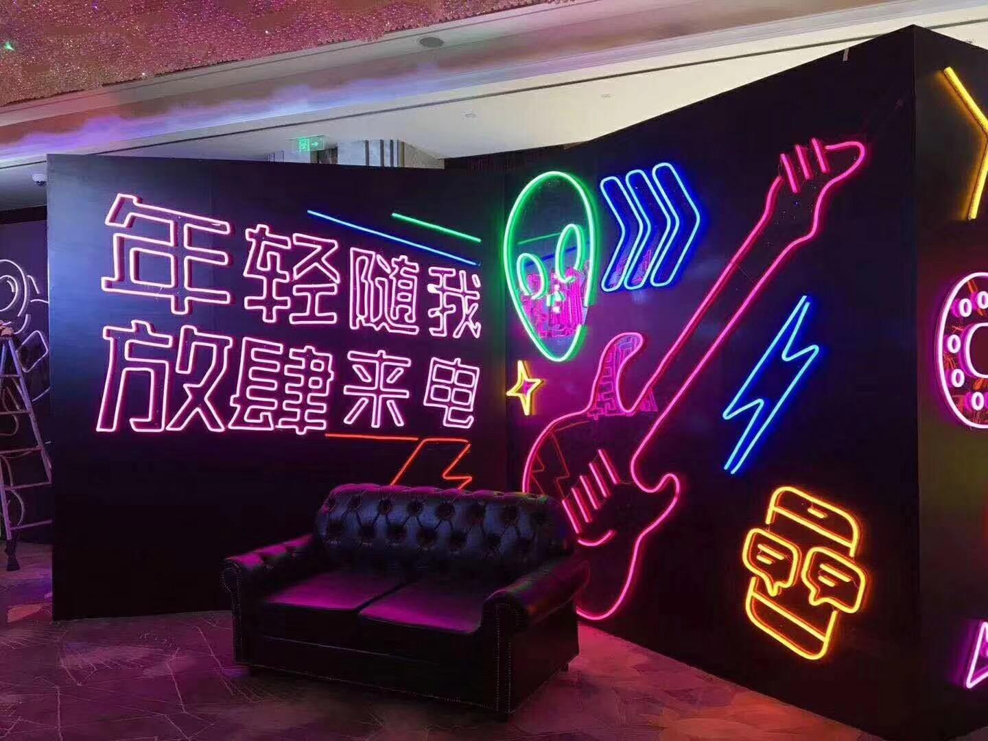
红色:需要注意红色的对比色为绿色,所以想显眼的话以绿色为主色调比较好至于用哪种绿色就建议是具体情况而定另外美观之类的那就建议靠个人经验和能力了。看周围环境,配合好,形成个比较抢眼的色调。明显色彩都需搭配才有美的一面,大红大绿是俗气,万绿丛中一点红那就是美丽。寻找可以对比的色调,如色红与绿、黄与紫、橙与蓝。这些色彩的搭配难,但效果是比较显眼且刺激的一种,注意只要中性色调和得当,对比色比例适当就是出现令人惊奇的效果。多种颜色的应用,这种色彩是高 贵、协调的的搭配,对比虽不强烈,但和谐,不过操作费事,注意黑白灰三大关系。

Red: you need to pay attention to the contrast color of red is green, so if you want to be conspicuous, it's better to use green as the main color. As for which kind of green to use, it must depend on the specific situation. In addition, it must depend on personal experience and ability to be beautiful. Look at the surrounding environment, with good, form a more eye-catching tone. Any color needs to match to have a beautiful side, red and green is vulgar, a little red in the green cluster is beautiful. Look for contrasting hues, such as red and green, yellow and purple, orange and blue. These colors are difficult to match, but the effect is more conspicuous and exciting. Note that as long as the neutral tone and appropriate contrast color ratio is appropriate, it will have a surprising effect. The application of a variety of colors, this color is noble, harmonious collocation, although the contrast is not strong, but harmonious, but the operation is cumbersome, pay attention to the relationship between black, white and gray.
相同似的同类色调,这是容易出效果的操作,只要把同类色搭配一起马上就会出现协调效果,如深红、大红、粉色等搭配,就会出现暖色调有温馨浪漫之意。大关系处理好,非常容易上手。创意的想法创意与色彩。有助于避免混合你的背景,或加上偶尔的轮廓,或下将的阴影。你建议小心不要使用太多的颜色,因为这会让人难以阅读。视觉混乱是常见的错误。尝试运用色彩,吸引目标观众。
The same kind of color, this is easy to effect the operation, as long as the same kind of color together, will immediately appear coordination effect, such as deep red, red, pink collocation, will appear warm color, warm romantic meaning. It's very easy to handle big relationships. Creative ideas, creativity and color. Don't worry about mixing your background, or adding occasional silhouettes, or shadows that will fall. You have to be careful not to use too many colors because it's hard to read. Visual confusion is a common mistake. Try to use color to attract the target audience.
感谢您的阅读,希望以上内容对您有所帮助,如想了解更多精彩内容请点击:济南广告制作公司https://www.hongchenad.com 。
Thank you for reading, hope the above content is helpful to you, if you want to know more wonderful content, please click: Jinan advertising production company https://www.hongchenad.com .